
How to Create a Line Graph: Excel, Google Sheets & Paper

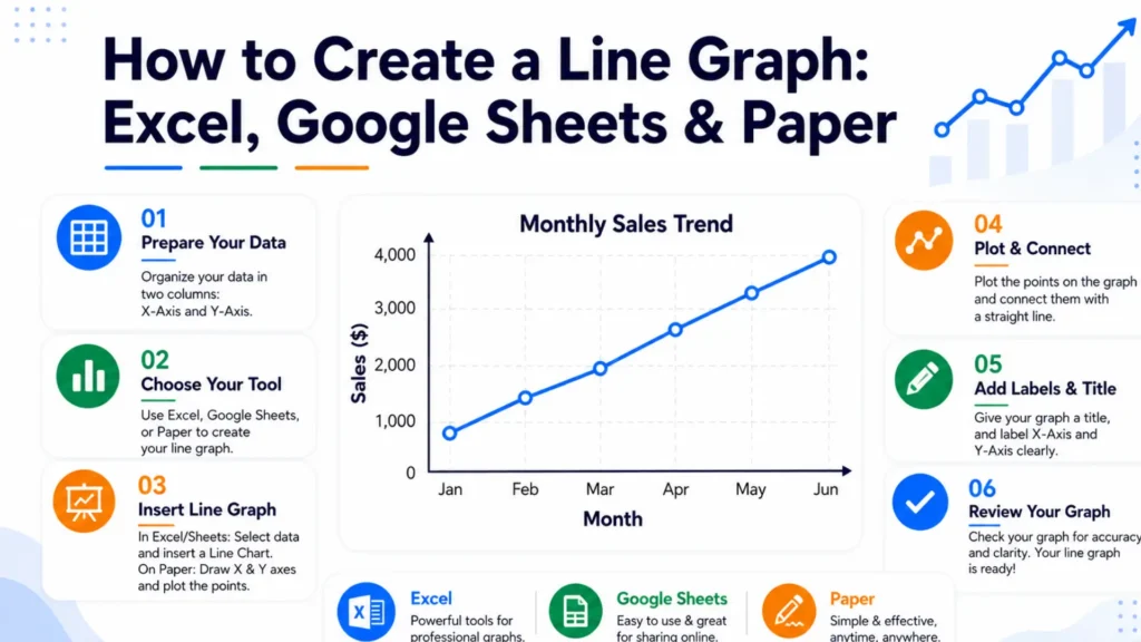
To create a line graph, organise your data into two columns, plot the values ​​on the graph, and connect each point with a line so that changes and trends are clearly visible. A line graph transforms numerical information into a simple visual format and makes it easier to analyze patterns, comparisons, and progress. It is widely used to track changes over time, compare datasets, and present information clearly across various fields.

This guide explains each method for creating a line graph and helps you create clear and accurate line graphs. Here, you will learn the essential process, formatting tips, and best practices for presenting data effectively.

Table of Contents

What Are The Core Steps Behind Every Line Graph?

Every line graph requires five core steps: identify your data variables, draw and label the horizontal and vertical axes, choose a balanced numerical scale, plot each data point with a dot, and connect those dots in order with straight line segments.

These fundamental principles apply universally, whether you are using software or creating a graph on paper.

How to Create a Line Chart in Excel (Step-by-Step)

You can select your data cells, go to the Insert tab, and click the Insert Line or Area Chart icon to make a line graph in Excel.

1

Organize Your Axes

  1. Identify your independent variable (what you already know, like a date).
  2. Identify your dependent variable (what changes, like sales).
  3. Sort your data into two columns: X values and Y values.
  4. Sort rows by X value, smallest to largest — unsorted rows make the line zigzag and misrepresent the trend.
  5. Remove blank cells, duplicates, or inconsistent formatting.
  6. Store X values as real numbers or dates, not text — text values get spaced evenly by most tools even when the real values aren't, which distorts the line's shape.
2

Choose the Right Scale for Each Axis

  • X-axis scale: Covers the full range of your data with equal spacing between increments.
  • Y-axis scale: Usually starts at zero. If your data range is small and zero flattens the trend too much, start higher and mark the break with a break symbol (⌇).

Each axis is scaled to fit its own data – the X and Y axes don't need to match each other. Label each axis with its data type and unit, such as "Time (weeks)" or "Revenue (USD)".

3

Open Your Line Graph Maker

  1. Open a free online line graph maker, or use Excel or Google Sheets.
  2. Select "Line Graph" or "Line Chart" as the chart type.
  3. Find the X-axis and Y-axis data entry fields.
4

Enter Your X-Axis and Y-Axis Data

  1. Enter your X-axis values.
  2. Enter the Y values that correspond to each X point.
  3. Add each additional data series separately if you're plotting multiple lines.
  4. Label each axis in the tool's settings.
5

Customize the Graph

  1. Add a descriptive title that states what the graph shows.
  2. Use a distinct colour for each line if you have more than one.
  3. Add a legend for multiple data series.
  4. Adjust gridlines, marker size, and line thickness for readability.
6

Review and Download

  1. Confirm every data point is plotted where you expect.
  2. Check that axis labels, units, and scales match your data.
  3. Export as PNG, SVG, PDF, or embed code.

How to Create a Line Graph in Google Sheets

You can select your data range, click Insert > Chart, and choose Line chart from the Chart type dropdown in the editor panel to make a line graph in Google Sheets.

  • Highlight your data range, including the column headers.
  • Click on Insert > Chart from the top menu.
  • In the Chart Editor sidebar, set the Chart Type to Line Chart.
  • If Google Sheets automatically selects the wrong columns, then adjust the X-axis and Series within the Setup tab.
  • Edit chart and axis titles in the Customize tab.
  • Change the line color and thickness under Series.
  • Toggle gridlines on or off under Gridlines and ticks.
  • Add a trendline via Series > Trendline.
  • Download the chart as a PNG or PDF or embed it directly onto a webpage.

Excel vs Google Sheets vs Paper vs Online Tools: Which Should You Use?

This table summarizes the key differences between Excel, Google Sheets, and online tools. You can choose the best option according to your requirements.

Compare different methods for creating a line graph to find the best fit for your task.

Method Setup Time Customization Best For
Excel Moderate High Business reports and forecasting
Google Sheets Fast Moderate Shared or live updating data
Paper Instant Low Classroom work and sketches
Online graph makers Fast High Presentations and social sharing

Who Uses Line Graphs?

  • Line graphs are used by people who need to track, show, or study how data changes over time. Common users include business workers, scientists, doctors, teachers, and weather forecasters who need to create a line graph to visualize trends and compare data clearly.
    • Data analysts use these graphs to compare data points, identify patterns, and make informed strategic decisions.
    • Educators and academic professionals use them to track student progress or retention rates in a simple and visual manner.
    • Researchers use line graphs to present trends from marketing campaigns or research findings in reports and blog posts.
    • Marketing teams use them for quarterly reports, performance metrics, and presentations to stakeholders.
    • Business professionals use line graphs to present results to investors or to compare the outcomes of different experiments.
    • Consultants use line graphs in proposals and success rate reports to clearly illustrate insights derived from client data.
Create a Line Graph

How to Make Better Line Graphs (5 Tips)

You should keep designs clean and simple by limiting data sets, labeling axes clearly, using distinct colors for different lines, avoiding cluttered legends with direct labels, and starting the y-axis thoughtfully.

  1. Limit each chart to a maximum of 3 to 4 lines because exceeding this number will make the graph cluttered and confusing rather than conveying a clear story.
  2. When comparing multiple series, use a distinct color for the key line and render the others in gray so that the primary information is easily understood.
  3. Round data labels to a reasonable number of decimal places because two decimal places constitute unnecessary detail.
  4. Align your X-axis intervals with the actual data and do not skip months, duplicate entries, or connect points.
  5. Recreate the chart in two different tools before finalizing it because all tools can reveal different design flaws.

FAQs:

Can I convert a paper line graph into a digital one later?

Yes, you can easily turn a paper line graph into a digital one by using computer software, phone apps, or web tools that trace or read the image data.

No, your line graph does not have to start at zero. Unlike bar charts, line graphs focus on the direction and rate of change over time.

No, you do not need Excel. Many free tools let you make line graphs quickly. These tools include Google Sheets, Canva, or free online graph makers.

You can download a line graph in many file formats like PNG, JPEG, SVG, and PDF. The exact options depend on the tool or website you use to make your graph.

Yes, you can easily add a trendline in Google Sheets by opening your chart editor, going to the Customize tab, selecting Series, and checking the Trendline box.