
Reading a linear graph involves understanding its axes, following the straight line, and analyzing the relationship between the two variables. A linear graph shows a constant change, so the line stays straight. You may need to read a linear graph for schoolwork, a business report, or information online. Once you understand the basic parts, reading a linear graph becomes easy.
In this guide, we will explain everything step by step. You will learn the basic parts of a graph, different types of linear graphs, and how to read them easily.
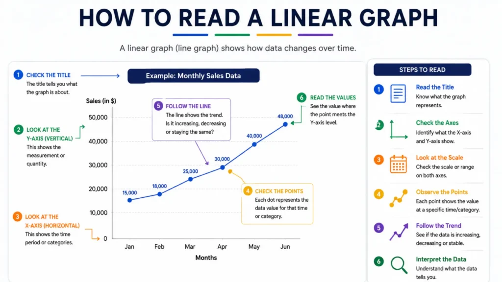
A linear graph (a graph with a straight line) consists of certain fundamental components. These components help us understand the graph and observe data trends.
In simple terms: In a line graph, the X-axis, Y-axis, origin, points, line, and gridlines come together to complete the graph.
You have to find labels for the horizontal (x)-axis and the vertical (y)-axis. Then, identify the starting point where the line intersects the vertical (y)-axis. Next, observe the steepness of the line, which is known as the slope. Finally, use the grid lines to match any (x)-value with its corresponding (y)-value.
This gives the background to the rest of the graph. It explains what is being measured, and will often give you a clue as to what it's being measured over time or in what categories.
Look at what the x-axis and y-axis represent. Without this, the numbers on the graph won't mean anything to you.
See the pattern for the numbers — are they counting by 1s, 2s, 5s, or any other number? This has an impact on the interpretation of the steepness of the line.
This is where the x-axis and y-axis meet, usually at (0, 0). Check whether the line passes through this point or not.
Identify whether it is rising, falling, or levelling off. This indicates the long-term movement.
To obtain an exact value, locate the point on the line, then draw straight down to the x-axis and across to the y-axis to read the numbers.
If you want to check whether the relationship is proportional, write the points as a ratio in the form y/x. If the ratio stays constant for all points and the line goes through the origin, the relationship is proportional.
One of the most important things on any linear graph is the slope, sometimes called the gradient. The slope describes how steep the line is and which way it points.
This formula can be used to calculate the slope from any two points on the line:
Slope = change in y ÷ change in x
Select any two distinct points on the line so that you can calculate the slope manually. The calculation is more accurate if these points lie at the intersections of grid lines.
Worked examples of the slope formula — (y₂ − y₁) / (x₂ − x₁) — applied to a few pairs of points.
| Point 1 | Point 2 | Slope Formula | Result |
|---|---|---|---|
| (0, 2) | (4, 10) | 10 − 2 4 − 0 | 2 |
| (1, 5) | (3, 1) | 1 − 5 3 − 1 | −2 |
| (2, 6) | (6, 6) | 6 − 6 6 − 2 | 0 |
| (3, 0) | (3, 8) | 8 − 0 3 − 3 | Undefined |
The y-intercept is the point where the line intersects the y-axis. It indicates the initial value before any change occurs.
Real-life example: In a graph showing taxi fares, the y-intercept represents the base fare.
Once you know the slope and y-intercept of the line, you can write the equation for the entire line. This step transforms a simple graph into a useful mathematical tool that can be used for calculations.
It is very easy to read a linear graph. You have to check the horizontal line (x-axis) for the labels and the vertical line (y-axis) for the numbers. Below, you can check the details of baseline, compound, and broken line graphs.
This is the most common type you’ll encounter, and it’s exactly what we’ve covered so far: a single line showing how one value changes over time or across categories. To read a linear graph effectively, you should first learn the basics of this type of graph, as all other types of graphs rely on it.
To read a basic line graph, just follow the line from left to right and notice whether it’s rising, falling, or staying level. Also look for any sudden jumps and drops because this can also indicate significant changes that will be noticed.
A compound line graph (or stacked line graph) displays cumulative totals where multiple data layers are stacked on top of each other. You can read it by looking at the title and axes, finding the value of individual layers by measuring the distance between consecutive lines, and reading the total from the topmost line.
The following is a guide to understanding compound line graphs:
You can read a broken line graph by looking at the title, checking the scale on both axes, finding specific data points by tracing lines to the axes, and analyzing the connecting line segments to understand upward, downward, or flat trends. These steps also help you read a linear graph accurately.
When you read a broken line graph, here’s what to keep in mind:
To put the above learning to use, here are two short examples.
Here are all the situations in which using a line graph is good.
Here are all the situations in which using a line graph is not good.
This table summarizes the different types af charts. You can check their uses and weaknesses below.
A quick reference for when to reach for each chart type, and where it falls short.
| Chart Type | Best For | Weakness |
|---|---|---|
|
Line Graph
|
Trends over continuous data (time) | Poor for unordered categories |
|
Bar Chart
|
Comparing categories at one point | Can't show smooth trends well |
|
Pie Chart
|
Showing proportions of a whole | Hard to compare more than 5 slices |
|
Area Chart
|
Emphasizing volume over time | Harder to compare exact values |
|
Scatter Plot
|
Shows correlation between two variables | Doesn't show ordered trends |
|
Dot Plot
|
Comparisons without a zero baseline | Less familiar to general audiences |
There are many different types of line graphs, and people can make mistakes while reading them. You can check all the details with this list.
Here are some practical tips that will help you in reading line graphs accurately.
In math, there are three main types of line graphs: simple, multiple, and compound line graphs. There are also different types like step, curved, area, sparkline, and band or range graphs. Each one is used based on the data you have.
The 3 main types of line graphs are the simple line graph, the multiple line graph, and the compound line graph. A simple line graph shows one change, a multiple line graph compares changes, and a compound line graph shows how a whole is split into parts.
The main types of line graphs are simple line graphs, multiple line graphs, and compound line graphs. Other variations include step line graphs, curved line graphs, area line graphs, sparklines, and band or range line graphs.
A non-linear line graph is one where the line is not straight. Instead, it is curved or bent. This happens when the data doesn’t go up or down in a regular way. A curved line graph is a common example of a non-linear graph.
A simple line graph has one line showing data over time. Whereas, a multiple line graph uses several lines on one chart to compare different sets of data at the same time. The difference is the number of things you measure.