
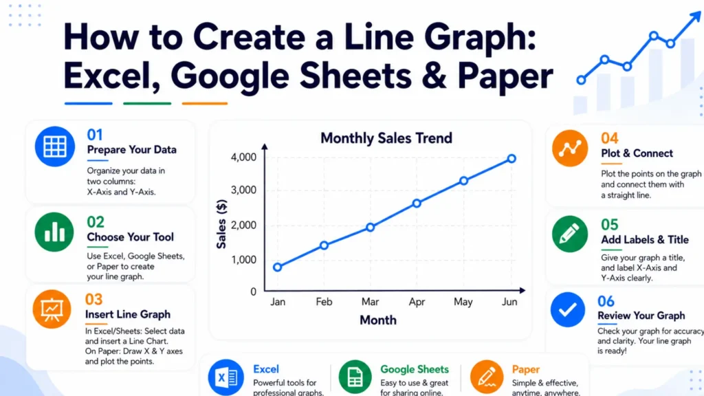
To create a line graph, organise your data into two columns, plot the values on the graph, and connect each point with a line so that changes and trends are clearly visible. A line graph transforms numerical information into a simple visual format and makes it easier to analyze patterns, comparisons, and progress. It is widely used to track changes over time, compare datasets, and present information clearly across various fields.
This guide explains each method for creating a line graph and helps you create clear and accurate line graphs. Here, you will learn the essential process, formatting tips, and best practices for presenting data effectively.

Every line graph requires five core steps: identify your data variables, draw and label the horizontal and vertical axes, choose a balanced numerical scale, plot each data point with a dot, and connect those dots in order with straight line segments.
These fundamental principles apply universally, whether you are using software or creating a graph on paper.
You can select your data cells, go to the Insert tab, and click the Insert Line or Area Chart icon to make a line graph in Excel.
Each axis is scaled to fit its own data – the X and Y axes don't need to match each other. Label each axis with its data type and unit, such as "Time (weeks)" or "Revenue (USD)".
You can select your data range, click Insert > Chart, and choose Line chart from the Chart type dropdown in the editor panel to make a line graph in Google Sheets.
This table summarizes the key differences between Excel, Google Sheets, and online tools. You can choose the best option according to your requirements.
Compare different methods for creating a line graph to find the best fit for your task.
| Method | Setup Time | Customization | Best For |
|---|---|---|---|
| Excel | Moderate | High | Business reports and forecasting |
| Google Sheets | Fast | Moderate | Shared or live updating data |
| Paper | Instant | Low | Classroom work and sketches |
| Online graph makers | Fast | High | Presentations and social sharing |
Line graphs are used by people who need to track, show, or study how data changes over time. Common users include business workers, scientists, doctors, teachers, and weather forecasters who need to create a line graph to visualize trends and compare data clearly.
You should keep designs clean and simple by limiting data sets, labeling axes clearly, using distinct colors for different lines, avoiding cluttered legends with direct labels, and starting the y-axis thoughtfully.
Yes, you can easily turn a paper line graph into a digital one by using computer software, phone apps, or web tools that trace or read the image data.
No, your line graph does not have to start at zero. Unlike bar charts, line graphs focus on the direction and rate of change over time.
No, you do not need Excel. Many free tools let you make line graphs quickly. These tools include Google Sheets, Canva, or free online graph makers.
You can download a line graph in many file formats like PNG, JPEG, SVG, and PDF. The exact options depend on the tool or website you use to make your graph.
Yes, you can easily add a trendline in Google Sheets by opening your chart editor, going to the Customize tab, selecting Series, and checking the Trendline box.