
A chart with too many crossing lines can confuse readers before they even understand the data. This mostly happens when the wrong type of graph is used for the task. Different types of line graphs are used for specific needs, whether it is illustrating a trend, comparing categories, or displaying figures in a layered format. Once you identify the right type for your data, then your chart becomes understandable.
This guide breaks down various types of graphs so you can determine which one suits your data and transform a confusing chart into a clear one.
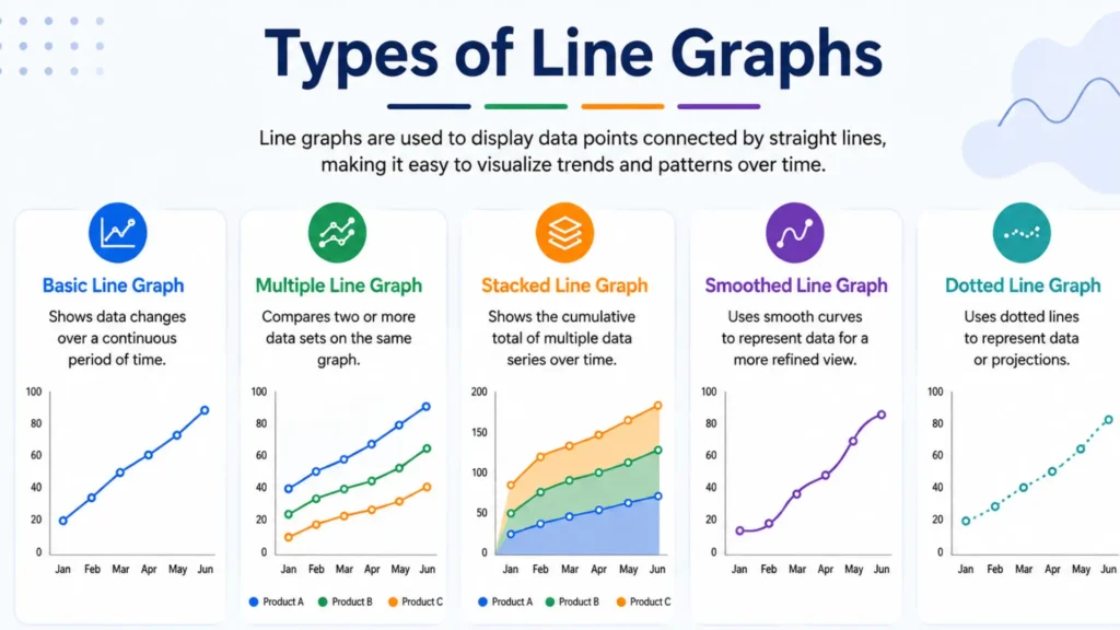
There are several related formats and Different Types of Line Graphs. Most theoretical frameworks categorize them into two basic designs.
There are three basic types of line graphs that are used to show data trends over continuous time. These different types of line graphs include simple line graphs, multiple line graphs, and compound line graphs. All the types are explained below.
A simple line graph is the easiest type of a graph. It has only one line on the chart, so it is very easy for you to understand it.
You use it when you want to show one thing over time. For example, you can use it to show how the temperature changes every day for a week, or how much money a small shop makes each month.
As there is only one line, it is very easy for you to see the changes. You can easily tell if things went up, down, or stayed the same.
This line graph is similar to a simple line graph, but it has two or more lines on the chart instead of just one. Each line shows a different thing, and they all share the same chart.
You can use it when you want to compare two or more things at the same time. For example, you can use it to show the changes in sales of two different products over a year, or if you want to compare the temperature of two different cities during a week.
Since all the lines are on the same chart, you can easily see how they relate. You can easily see which one is higher, which one is lower, and where they meet.
The compound line graph is a little different from the other two. In a compound line graph, the lines are placed on top of each other instead of being shown separately. Each layer is placed on top of the one below it, so the chart shows the total and each part.
You can use it to show how different parts build a whole over time. For example, you can use it to show how your total monthly budget goes to food, rent, and transport each month.
The bottom layer shows the first value, the next layer adds the second value on top, and it continues like this. This can help you see each part and the overall total at the same time.
Advanced line graphs are among the Different Types of Line Graphs used to display complex data that basic line graphs cannot represent. They are useful for comparing multiple datasets, showing values, utilizing dual axes for measurements, and highlighting sudden changes.
A step line graph is a little different from a regular line graph. Instead of a straight or smooth line, it goes up and down like stairs. The line is flat, then goes up or down, then flat again.
This is just like a simple line graph, but instead of straight lines between the dots, the line is smooth and curved. It makes the chart look softer and more natural.
An area line graph looks a lot like a simple line graph, but the space under the line is filled with color — that's what makes it an area line graph.
A sparkline is a very small, simple line graph — just a small line with no labels, axis, or title. It can be placed in a table, sentence, or data screen without taking up much space.
A band or range line graph uses two lines and fills the space between them with color. The top line shows the highest value and the bottom line shows the lowest value — the filled-in space between them is called the band.
It is an easy way to show high and low values, so you can see the data more clearly.
There are many different types of line graphs and lines used on a graph. These lines include solid, dashed, dotted, curved, stepped, thick, and thin lines. Each line serves a distinct purpose and helps represent data in different ways.
A quick reference for what each line style typically means on a line graph, and when to use it.
| Line Style | What It Represents | Common Use |
|---|---|---|
|
Solid line
|
Actual and confirmed data | Historical trends |
|
Dashed line
|
Projected or forecasted data | Future estimates |
|
Dotted line
|
Secondary or reference data | Benchmarks |
|
Curved line
|
Smoothed or modeled trend | Long-term patterns |
|
Stepped line
|
Discrete and instant changes | Pricing tiers |
|
Thick vs thin line
|
Emphasis or hierarchy | Highlighting a key series |
The title of a graph tells you what it is about. It is shown at the top of the chart and quickly tells you what the data is about. Your title should be short and clear, so people know exactly what they’re looking at.
The x-axis is the bottom line of the graph. It usually shows time, like days, months, or years. The y-axis is the line that goes up the side of the graph, and it shows the numbers you are tracking. Both lines together create a chart for the data.
Labels tell you what each axis is about. If there is no label, you would not know what the numbers on the graph mean. Such as, the x-axis can be Months and the y-axis can be Sales in Dollars. Labels help you understand the graph quickly.
The scale is the numbers on the y-axis. It shows the value of each step on the axis. Think of a scale going from 0 to 100, with steps of 10. Choosing the right scale is important because it can change how the data looks.
Points are the dots on the graph that show the values in the data. Each point is where the time and value meet on the graph. All the points connect to make a line.
The line connects all the points and shows how things changed. Among the Different Types of Line Graphs, a multiple line graph has more than one line, and each line has a different color. The legend shows what each color means, so you know which line belongs to which category.
You should use a line graph to display changes in data over a continuous interval or time period. Different Types of Line Graphs can display individual data points on an x-axis and a y-axis and connect them with straight lines. You can check the details below.
Here are all the situations in which using a line graph is good.
Here are all the situations in which using a line graph is not good.
This table summarizes the different types af charts. You can check their uses and weaknesses below.
A quick reference for when to reach for each chart type, and where it falls short.
| Chart Type | Best For | Weakness |
|---|---|---|
|
Line Graph
|
Trends over continuous data (time) | Poor for unordered categories |
|
Bar Chart
|
Comparing categories at one point | Can't show smooth trends well |
|
Pie Chart
|
Showing proportions of a whole | Hard to compare more than 5 slices |
|
Area Chart
|
Emphasizing volume over time | Harder to compare exact values |
|
Scatter Plot
|
Shows correlation between two variables | Doesn't show ordered trends |
|
Dot Plot
|
Comparisons without a zero baseline | Less familiar to general audiences |
There are many different types of line graphs, and people can make mistakes while reading them. You can check all the details with this list.
Here are some practical tips that will help you in reading line graphs accurately.
In math, there are three main types of line graphs: simple, multiple, and compound line graphs. There are also different types like step, curved, area, sparkline, and band or range graphs. Each one is used based on the data you have.
The 3 main types of line graphs are the simple line graph, the multiple line graph, and the compound line graph. A simple line graph shows one change, a multiple line graph compares changes, and a compound line graph shows how a whole is split into parts.
The main types of line graphs are simple line graphs, multiple line graphs, and compound line graphs. Other variations include step line graphs, curved line graphs, area line graphs, sparklines, and band or range line graphs.
A non-linear line graph is one where the line is not straight. Instead, it is curved or bent. This happens when the data doesn’t go up or down in a regular way. A curved line graph is a common example of a non-linear graph.
A simple line graph has one line showing data over time. Whereas, a multiple line graph uses several lines on one chart to compare different sets of data at the same time. The difference is the number of things you measure.